Cozy Fall Coloring Ideas: 5 Rainy-Day Palettes to Try
Not sure which colors to use? Start with a fall palette, see where each shade can go, and try it with the pencils or markers you already own.
By Bright Little Hours
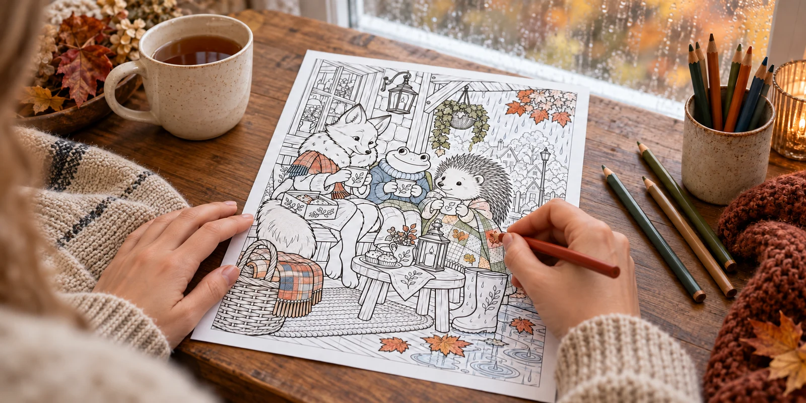
You pick a coloring page and make something warm to drink. Rain is tapping against the window. Then you open the marker case, and forty colors all look possible.
Orange leaves, brown branches, yellow pumpkins: it’s a dependable combination. But autumn has room for smoky blues, dusty pinks and deep plum, too.
These cozy fall coloring ideas give you five palettes to start with, suggestions for where each shade can go, and three versions of the same woodland scene to compare. Choose the mood you want, then try it with the pencils or markers you already own.
What colors go well together for fall coloring?
For a familiar fall combination, try rust, moss green and warm cream. For something quieter, pair smoky blue with brown and oatmeal. Plum, dusty rose and a little gold suit an evening scene.
You don’t need to plan every object. Start with a small area, then repeat a few colors across the page. If you’re coloring with kids, a short fall nature walk can give you a few real leaves and colors to notice before choosing your palette.
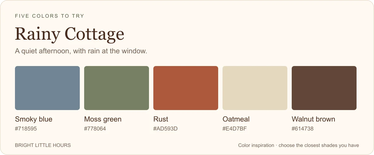
1. Rainy Cottage
Try smoky blue, moss green, rust, oatmeal and walnut brown.
Think of a cottage window on a gray afternoon, with wet leaves outside and something warm waiting inside.
Use smoky blue for the window view, ceramics or small fabric details. Rust and walnut keep the page seasonal, while oatmeal leaves breathing room between darker areas. Start with one blue object, then repeat a little of that blue elsewhere.
2. Lantern Walk
Try amber gold, burgundy, deep pine, warm cream and charcoal.
Let amber do the glowing. Lanterns and windows can carry the brightest color while burgundy and pine fill larger areas around them. Charcoal works for roofs, paths and shadows.
Keep some cream around the lights and on a few larger objects. A burgundy cushion, book spine and flowerpot can tie distant parts of the scene together.
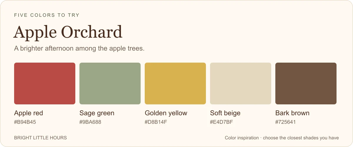
3. Apple Orchard
Try apple red, sage green, golden yellow, soft beige and bark brown.
For a brighter fall afternoon, let red be the accent. A scarf, an apple basket or a painted door can be enough.
Sage softens the familiar red-and-yellow combination, while beige and brown give you quieter colors for the spaces around it. Try this palette on village scenes, woodland animals or harvest stalls.
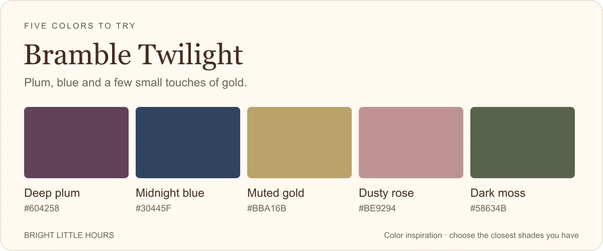
4. Bramble Twilight
Try deep plum, midnight blue, muted gold, dusty rose and dark moss.
Here’s the palette for people who look at an orange marker and think, “Maybe not today.”
Use midnight blue in the deepest areas, with plum on objects you might normally make red or brown. Give dusty rose a little space on fabric or a cottage wall. Small touches of gold can draw attention to a lantern, cup or window.
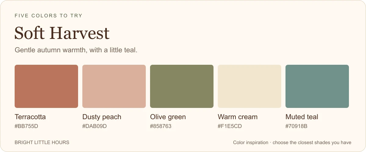
Terracotta gives you autumn warmth, while peach softens the surrounding areas. Olive works wherever you would usually reach for leaf green.
Save small touches of teal for mugs, doors, blankets or painted furniture. Use warm cream generously so stronger colors have space around them.
Try the same page three ways
If you’re using printable pages you may reproduce for personal use, make three copies of the same drawing. Try Rainy Cottage, Lantern Walk and Bramble Twilight, keeping the main color placements similar: a light wall, a darker view, one accent on a character.
If you’re coloring in a paperback, test the three palettes on scrap paper first, then choose one for the page in your book.
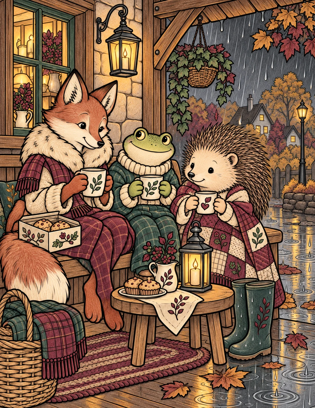
Below, the same Bramble Woods drawing is colored in three different moods. Compare the window, fabrics and small warm accents. Borrow a whole palette or just a pairing you like.
These are digital coloring examples for inspiration. The paperback and printable editions contain black-and-white line art; paper, supplies, and screens can make the same colors look different.
Rainy CottageLantern WalkBramble Twilight
Use the colors you have
Start with three main colors if five feels like too many decisions. Bring in a pale shade and a darker one when you need them. This is a starting exercise, not a rule your page has to obey.
Match the job of a color before worrying about its name. Pale beige can stand in for oatmeal; a darker blue can replace midnight blue. Test your choices together on a scrap of the paper you’re using.
If your teal is brighter than the swatch, try it on a small mug first. The palettes are a starting point, not a shopping list. The same small-palette approach works in December, too: try it on cards, gift tags, and bookmarks at a Christmas craft party with friends.
Five starting points for your next fall coloring page.
Try the palettes in Bramble Woods
Looking for a scene to color? Bramble Woods Autumn offers detailed fall coloring for adults and teens.
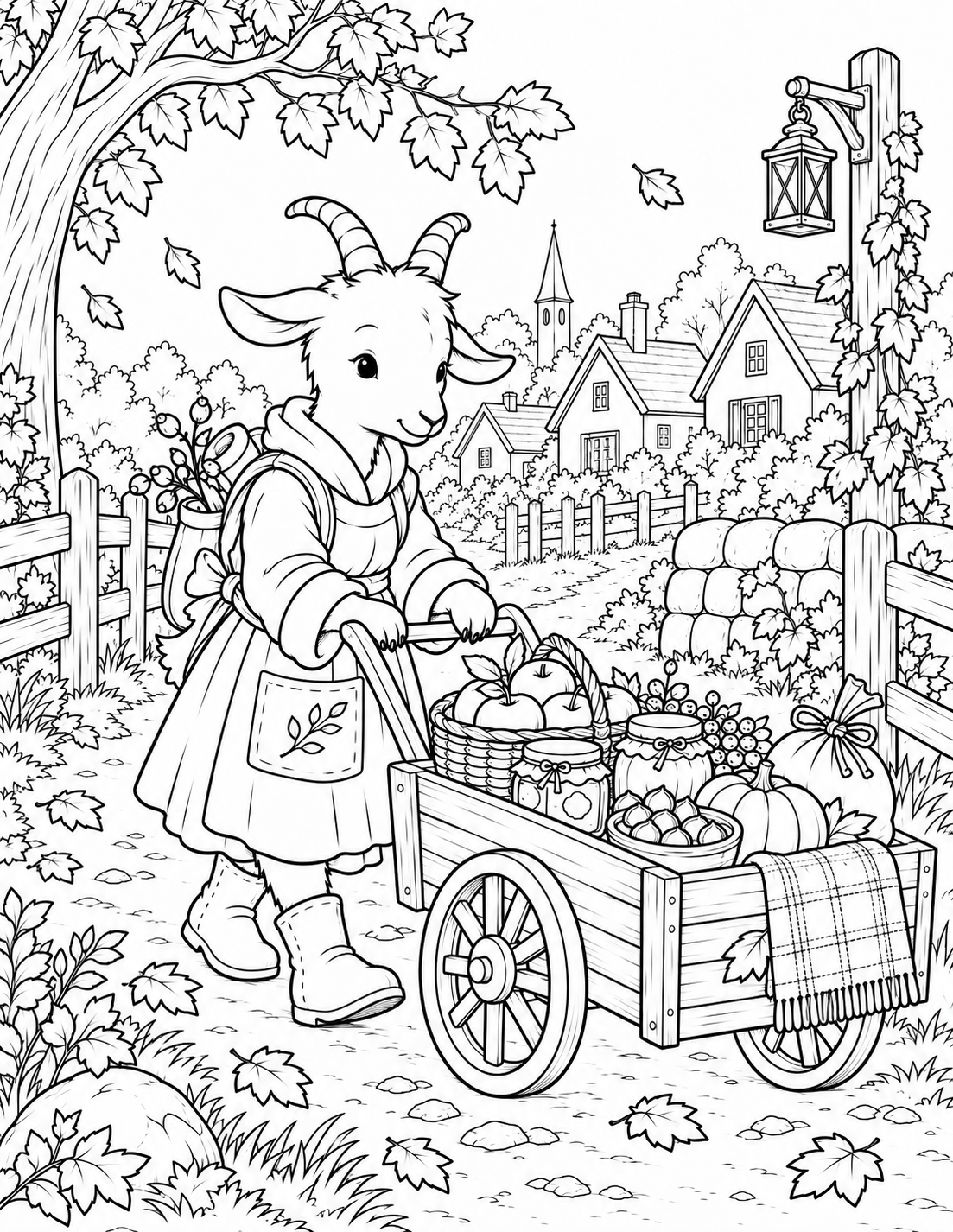
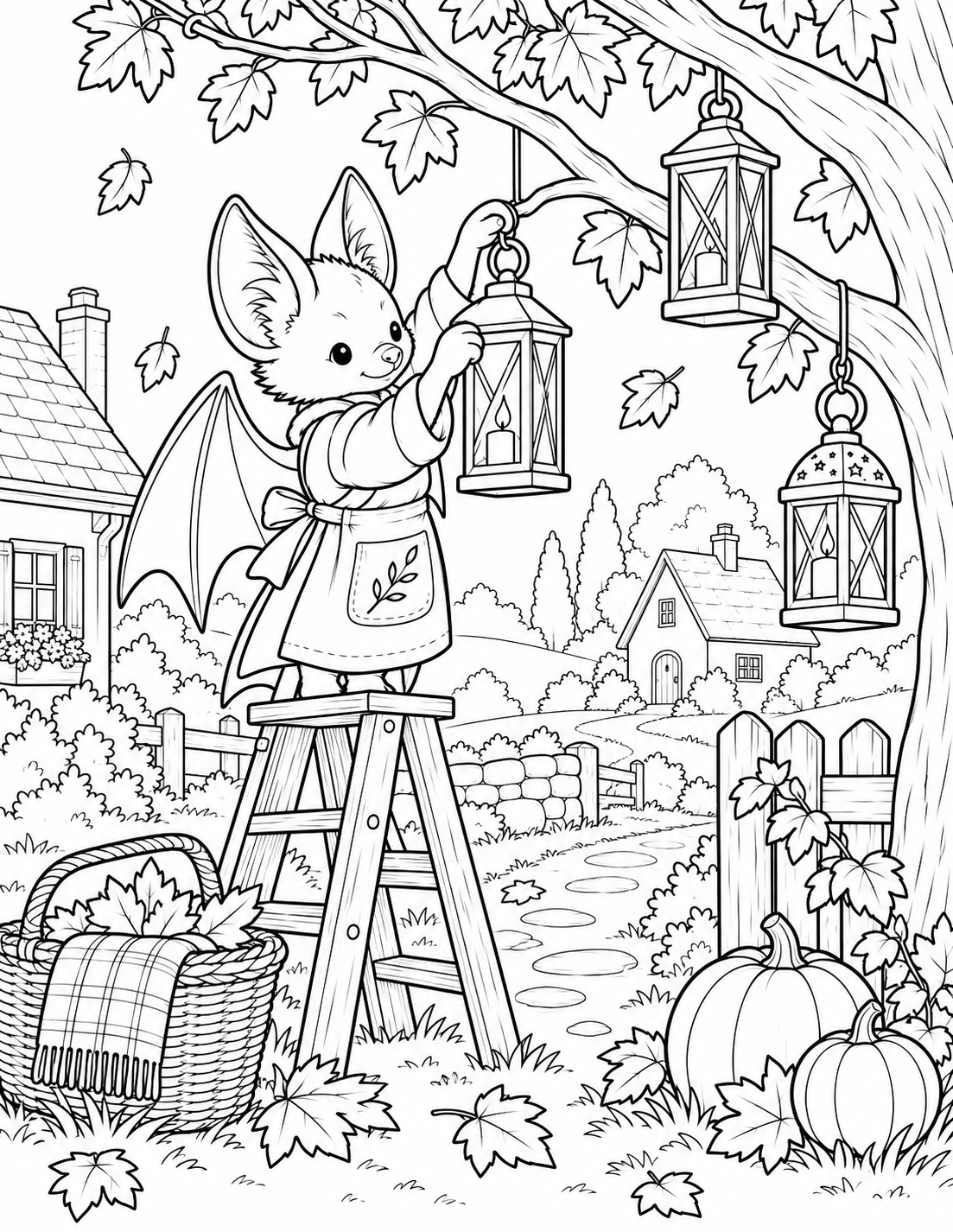
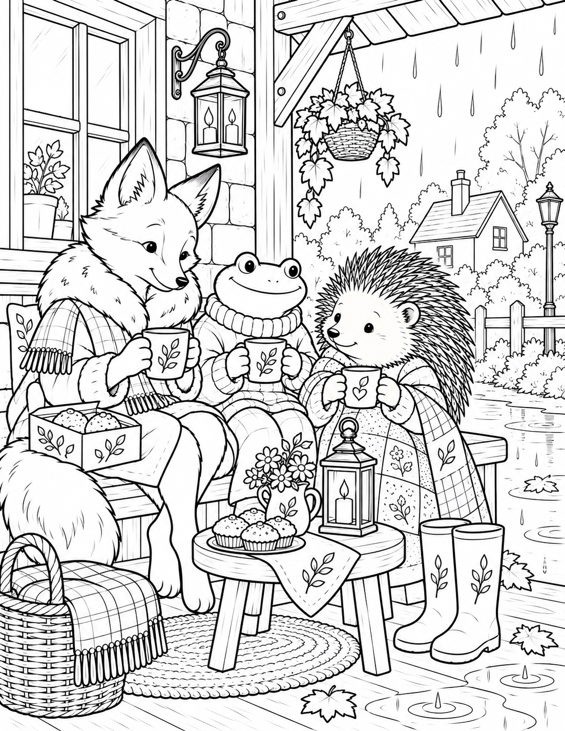
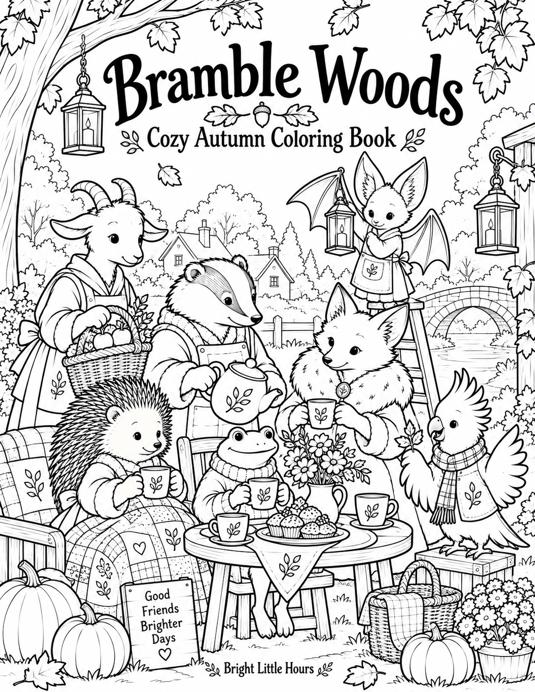
Three black-and-white previews from the Autumn printable collection.
Printed paperback
A paperback to color in
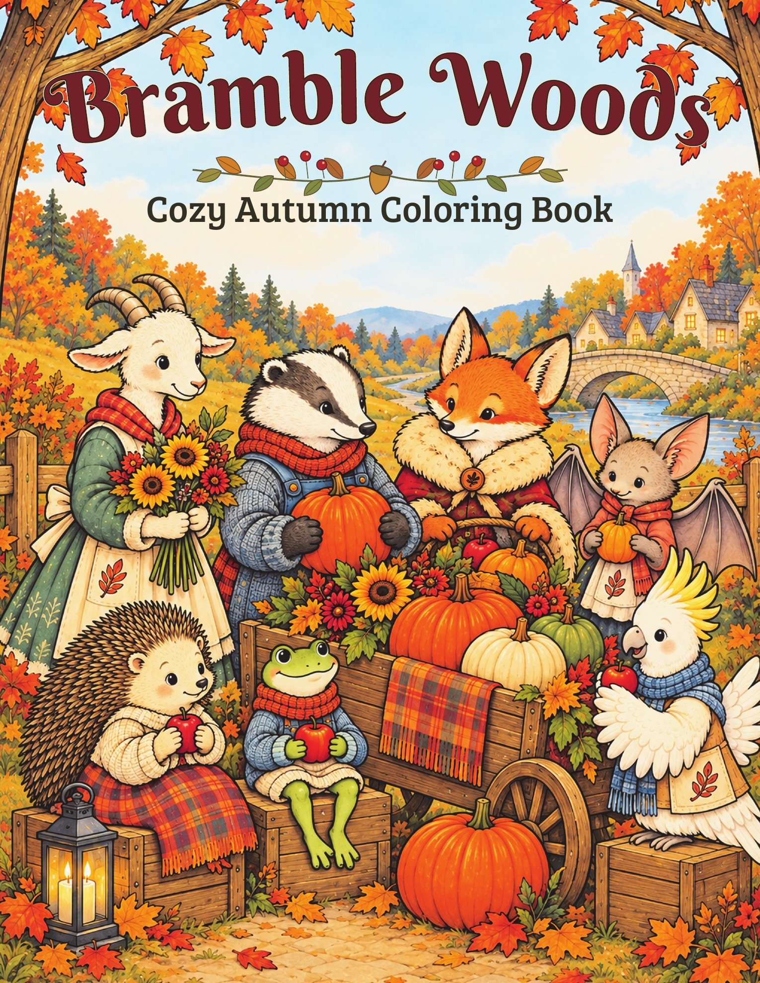
Bramble Woods Cozy Autumn Coloring Book has 26 detailed autumn scenes in a printed paperback. Open the book, choose a picture, and color with your own supplies.
Some product links on this page are affiliate links. As an Amazon Associate I earn from qualifying purchases.
Printable PDF · A4 + US Letter
Pages to print at home
Bramble Woods Autumn Coloring Book includes 26 detailed black-and-white scenes as A4 and US Letter PDFs. Print a page at home and try another palette on a fresh copy for personal use.